A Glamping Brand With a Real Sense of Place
ROAM Beyond — a WordPress site that sells the feeling of a Cascade morning before it sells a booking
Overview
ROAM Beyond runs handcrafted, mobile glamping experiences in Washington’s Cascades and in Montana — sustainable safari-style cabins, a strong design sensibility, and a small, repeat-customer-heavy following. Their flagship is The Haven Experience, a four-night stay in the Cascades.
Most of their guests had been finding them through editorial coverage, word of mouth, and Instagram. The website’s job was to take that warm interest and convert it. Until the rebuild, it wasn’t quite doing that.
The Challenge
Boutique hospitality lives or dies on the feeling a website gives you in the first ten seconds. ROAM’s brand is calm, considered and a bit cinematic — and the site needed to match. The old build was clean enough, but it wasn’t telling the story properly.
Imagery wasn’t doing the work
Stunning photography from the experiences was buried below long blocks of intro text. The first thing a visitor saw was language, not landscape.
Inquiry funnel was vague
Booking flows for boutique glamping are inquiry-led, not instant-checkout. The old form didn’t gather enough information to qualify, so the team spent hours on back-and-forth emails.
No real story per location
Washington and Montana experiences shared the same template. Travellers couldn’t get a feel for what made each one different.
Press wasn’t visible
ROAM had been covered in solid travel publications. None of that surfaced clearly on the site.
Mobile felt heavy
Big videos and high-resolution gallery images meant slow loads on the kind of mobile networks people actually use when researching trips.
Our Approach
We treated this like an editorial project as much as a web project. Spent time looking at the brand’s content library, the kind of guests who book repeat trips, and the storytelling tone the founders had been developing across social.
The technical decision was easy — WordPress, custom theme, no off-the-shelf hospitality theme. Off-the-rack themes always end up looking like every other glamping site. Our WordPress development services team mapped the IA around two journeys: ‘I’m dreaming’ and ‘I’m planning a specific trip’, because those visitors want completely different things.
We also leaned on motion deliberately, not for showiness. Slow image transitions, soft parallax, video that auto-pauses out of view. The goal was to feel like a quiet morning, not a busy site.
Solution Delivered
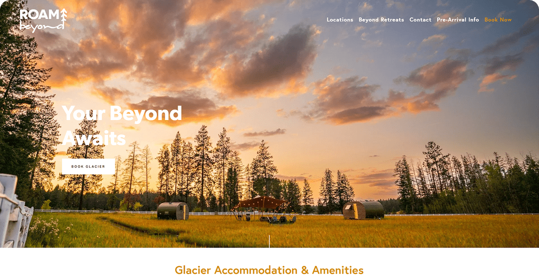
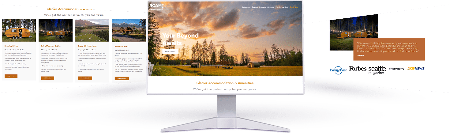
The new site opens with full-bleed cinematic imagery from the actual cabins, paired with very little copy — just a feeling and a route to the two destinations. From there, every experience has its own dedicated page with a sense of place: location-specific photography, a written ‘a day at…’ section, the practicalities (what’s included, what to pack, what the weather is like), and a press strip with real publication marks.
The inquiry funnel got a real overhaul. Instead of a single contact form, we built a guided trip planner that asks the right questions in the right order — group size, preferred dates, experience interest, dietary needs, special occasions. By the time the form hits the team, they have everything they need to send a qualified, personalised reply on the first try.
We also published a simple journal section — long-form posts about the Cascades, sustainability, the people behind the cabins. That’s now a steady SEO contributor for terms like ‘glamping Washington’, ‘luxury camping Montana’ and a handful of long-tail dreaming queries.
Performance-wise, every gallery uses a low-res blur-up pattern, video is poster-first, and we serve different image sizes per device. The site feels rich without being heavy.
Glimpses of Ski Outlet Venray
Key Features

Cinematic homepage
Full-bleed video and motion, minimal copy, two clear paths into the experiences.

Per-experience storytelling
Dedicated pages for Washington and Montana, each with its own voice and detail.

Guided trip planner
Multi-step inquiry form that pre-qualifies leads and saves the team hours.

Press wall
Editorial mentions surfaced with logos, pull quotes and links.

Journal section
Long-form posts that drive dreaming-stage SEO traffic.

Lazy-loaded gallery
Blur-up patterns and per-device sizes for fast mobile performance.

Calendar peek
A soft availability indicator that nudges visitors to inquire for the dates they want.

Newsletter capture
Tasteful sign-up with a real reason to subscribe — not just a popup.
Results and Outcomes
First booking season after launch.
+ 86% inquiry volume
More forms submitted, with better-quality information per inquiry.
– 65% time-to-first-reply
Team needs less back-and-forth thanks to the guided form.
+ 142% Journal traffic
Long-form content driving dreaming-stage searches.
Mobile LCP under 2s
On homepage and experience pages, on real-world 4G.
+ 31% repeat-guest visits
Returning visitors browsing experiences they hadn’t tried yet.
Technology Stack


WordPress + Custom Theme
Editorial-first build with custom Gutenberg blocks.


PHP 8.2 / MySQL
Standard, performance-tuned.

Gravity Forms (multi-step)
Guided trip planner with conditional logic.

Cloudflare Images
Per-device image variants and CDN delivery.


GSAP + lightweight CSS animation
Motion that respects prefers-reduced-motion.

Mailchimp
Newsletter and seasonal trip-drop announcements.

Yoast SEO
Schema for travel and editorial content.

Plausible Analytics
Cookie-light analytics aligned with the brand’s privacy stance.
Conclusion
ROAM Beyond’s product is the feeling of being out there, away from things, and noticing them again. Their site now leads with that, and only asks for a booking after the visitor’s already half-imagined their trip. The numbers followed.
Boutique hospitality is one of those categories where the wrong website actively repels customers. If you’re rebuilding something in this space, hire WordPress developers who can resist the urge to ship a generic theme and actually slow down on the storytelling.

 Let’s build success Together